


Naming, Brand Strategy & Visual Brand Identity
for a local emerging company that’s reshaping the art trade
by empowering artists and immersing buyers.
Story
"The Starving Artist" is a term coined more than a few hundred years ago and an iconic personage in our history books, that is still part of our vocabulary to this day. But what prompts this lifestyle in our current day and age? Fortelier discovered that many of today’s artists, especially in Bulgaria, are struggling to create and keep up with their online personas. While others simply don't have the time or expertise to manage the business side of their artwork. Both of these are obstacles for artists that are directly affecting their growth.
Strategic positioning
The bulk of Fortelier's competitors on the regional market were galleries and online platforms that were self-centered, focusing on their reputations and big buyer names. Here lies Fortelier's strong suit and we identified this as an opportunity to position them as a platform that puts the artists in the spotlight. Their focus is on creating a safer environment for the artists through transparency and taking care of the business and marketing end, as well as encouraging a deeper artist-buyer connection rather than the usual artist-gallery-buyer route.
Naming
When it came to the naming criteria, we wanted a strong-sounding name that evoked a feeling of trustworthiness, empowerment and care. We aimed to get away from the generic names that included “art”, “gallery” or naming the company after the owners. Our focus needed to center around the artists, so we came up with Fortelier. A mix of the words “Forte”, meaning talent, as well as strength, and “Atelier” - representing their workspace. The decision to choose a made-up word further enhanced the endeavor that Fortelier was undertaking.

Visual Identity
A large part of the design decisions were based on the idea that Fortelier was the stage upon which the artists will shine.
We created a custom logotype, based on the Berlingske Bold Stencil Serif font. The typography needed to provide the brand with a solid, sophisticated and craftsman's look & feel. We wanted a monogram that captured the power of an artist’s virtue - their forte. We took their main letter “F” and transformed the cross stroke into a star. Our end result was a well balanced monogram that worked in unison with the logotype.
For the visual language we developed a collection of stars originating from the brand's monogram to provide the design system with a new layer. This allowed us to present a variety of artists in a flexible, yet consistent way.


The system itself is open and can be developed further with additional interpretations of the iconic star symbol to match the growing collection of artists. The graphic interpretations of stars can work as a container or as a base to the artwork, depending on the specifics of each item.


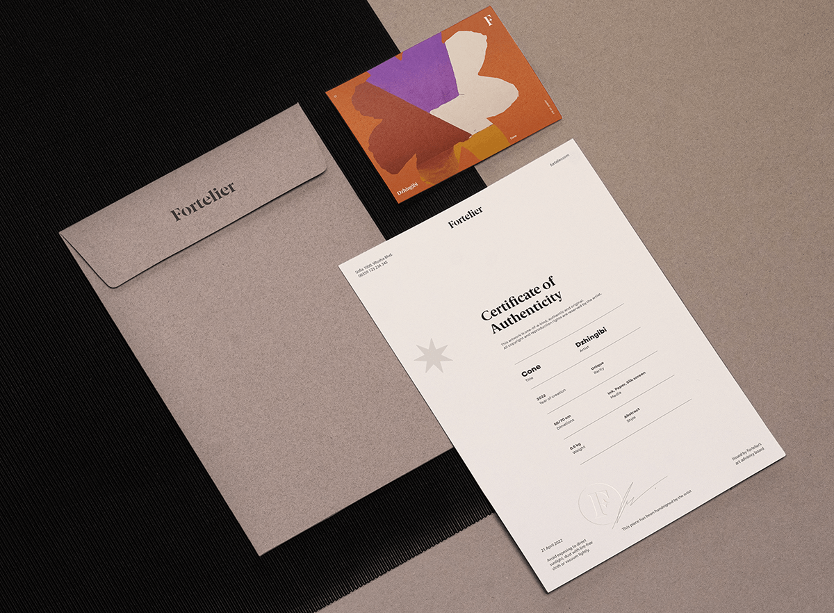
Fortelier’s stationery relies on a monochromatic grayscale approach that delivers a neutral look & feel. Enabling the brand to live out its strategy and focus on artists & their artwork. Every developed material consciously promotes the artist's work and aims to build a harmonious palette around the artwork’s individual color scheme.

Credits
Creative Direction: Ivaylo Nedkov
Graphic Design: Ivaylo Nedkov / Tsvetislava Koleva
Client Service: Vera Schwartz
Brand Strategy: Dessi Gerasimova
Naming: FourPlus Studio
Video Production: handplayed.
Animation: Alex Zhelyazkov / Jelio Dimitrov / Vess Blackstone
Special thanks to Krista Radoeva for the helpful typography feedback.


